The Man Behind The Wave-Wolfgang Weingart

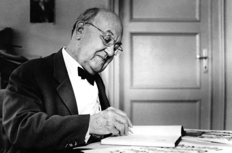
He started it all. It was he who ignited the spark of ‘typographic anarchy’ that exploded on the verge of the nineteen nineties. It was he who fathered what was subsequently dubbed Swiss Punk, or New Wave Typography, perhaps even post-modernism. His name is Wolfgang Weingart. Wolfgang Weingart was born in 1941 Switzerland. Weingart spent his childhood in Germany, moving briefly to Lisbon in 1954 with his family. In April 1958 he returned to Germany and began his studies at the Merz Academy in Struttgart, where he attended a two year program in applied graphic arts. This is where he learned about typesetting.


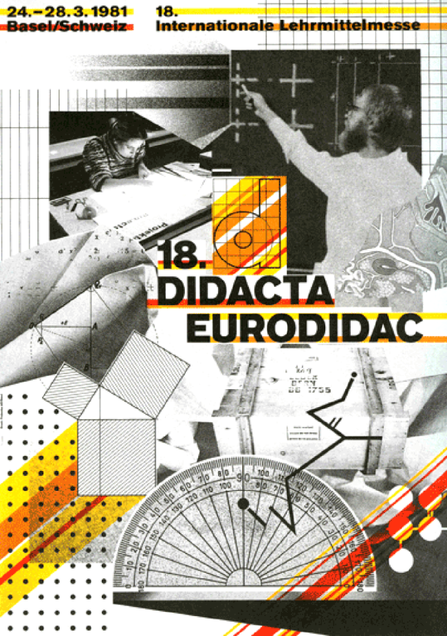
Image

Didacta Eurodidac 1980-81


After working at a typesetting firm, Weingart decided to further his education by attending the Basel School of Design. There he worked under Armin Hoffmann and Emil Ruder. Through his studies he was introduced to Swiss typography, or The International Style. The International Style was based on the Bauhaus movement and used grid systems as the foundation for type and image layout. As stated in his biography from one of my sources, in 1968, Weingart began teaching typography at the Basel School of Design. During his time at Basel the postgraduate course he proposed and taught was a drastically different from the principles of order, clarity, pattern and rhythm taught by Emil Ruder.


Image

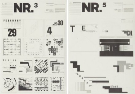
Typographic Process, Nr 1. Organized Text Structures 1974


It was his new approach to typography that influenced the development of New Wave, Deconstruction and much of graphic design in the 1990s. While he would contest that what he taught was also Swiss Typography, since it developed naturally out of Switzerland, the style of typography that came from his students led to a new generation of designers that approached most design in an entirely different manner than traditional Swiss typography.

 Image 

 Das Schweizer Plakat 1984


 Weingart’s students included April Greiman, Jim Faris, Franz Werner, Robert Probst, Jerry Kuyper and Emily Murphy.The design process he employed was very interesting to learn about, and the whole process is explained in this AIGA article excerpt. Students were simply asked to consider the appropriate size, weight and style of the letters they wanted to use. They set the type by picking the lead letters individually from the type case and placing them side-by-side in a composing stick, carefully determining the proper letter spacing, end-of-line spacing and leading. The finished composing was printed in a letterpress proofing press and dried with baby powder. Students then cut it apart and began to design. In order to eliminate the shadows of the cut paper and see their compositions as one plane, a piece of glass was gingerly lowered over the surface. This whole process seems extensive, but came out with awesome results. Wolfgang, came out on top of his typography style. He, not only was daring to try a new style, and then teach it for almost 40 years, but lead a new wave of artist to do the very same in his wake.

Image

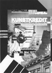
Kunsthalle Basel Kunstkredit 76-77 1977


http://www.aiga.org/medalist-wolfgang-weingart/
http://www2.palomar.edu/users/gkelley/Weingart.html

http://jenniferfidler.com/images/wolfgangweingart.swf

Jan Tschichold, Typography Titan

Jan Tschichold as we know him is the man that applied new typography approaches to everyday design problems and explained them to a wide audience of printers, typesetters, and designers. Before the war, he was very hated by the Nazi, being accused of being a cultural Bolshevik, and for creating un-German typography, as said in the Meggs textbook. This German type and book designer revolutionized modern typography through his bold, asymmetrical designs and use of sanserif typography, both inspired by the work of the Bauhaus. The son of a sign painter, Tschichold was born in April of 1902 in Leipzig, Germany. He was trained in calligraphy, which would set him apart from almost all other noteworthy typographers of his time. From strongly advocating the beauty of sans serif fonts and clean, organised design 20 years before it took off, to strengthening the design of Penguin books to turn them into the something special that they are. Jan Tschichold spent a life learning and exploring and left us with much to do the same. His work and expertise paved the way for designers and typographers today in astronomical ways. 

Image1914’s Worlds Fair of Books and Graphics was a huge experience for a young Tschichold. He was influenced by studying the books of Edward Johnston and Rudolf von Larisch and their many writings. His interest for old typefaces started to form at this time. He started this at a young age making this feat very impressive. Tschichold had converted to Modernist design principles in 1923 after visiting the first Weimar Bauhaus exhibition. He became a leading advocate of Modernist design: first with an influential 1925 magazine supplement; then a 1927 personal exhibition; then with his most noted work Die neue Typographie

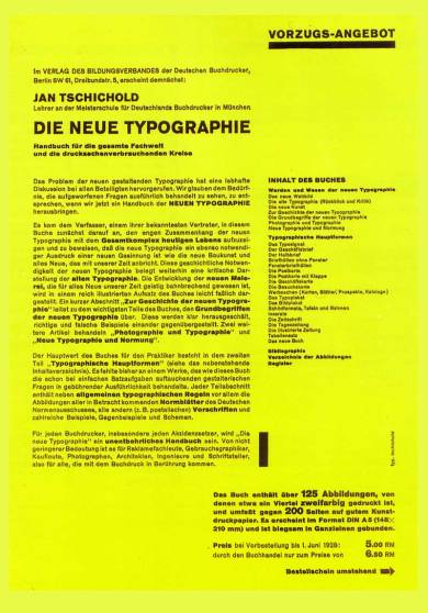
ImageOriginal prospectus for Die Neue Typographie, Jan Tschichold, 1928

Although Die neue Typographie remains a classic, Tschichold slowly abandoned his rigid beliefs from around 1932 onwards as he moved back towards Classicism in print design. He later condemned Die neue Typographie as too extreme. He also went so far as to condemn Modernist design in general as being authoritarian and inherently fascistic. Tschichold became more and more irritated by the typography of the times. He was strongly influenced by modern painters like László Moholy-Nagy and El Lissitzky, whose works used contrasting forms to display balance and conflict. Tschichold believed that the cure for typography lay in abandoning rules, adopting symmetrical setting, and the exclusive use of sans serif typefaces.

Image


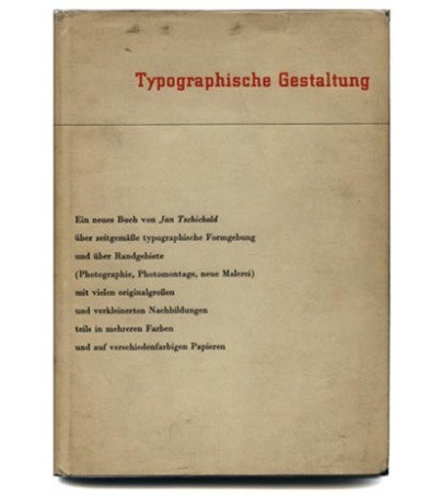
Typographische Gestaltung,Typographic Design, published in English as Asymmetric Typography, 1935

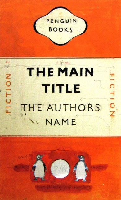
In 1946 he relocated to London at the invitation of Allen Lane of Penguin Books. The three years that followed influenced the design of books for many years to come. At the time Penguin was far from unsuccessful, their now infamous business plan clearly worked. It was their design that was lacking. The biggest task for Tschichold was to establish a set of rules to be used across all books to be published by Penguin. A four page guide was given to all those concerned and covered all things from margins to italics, from punctuation to footnotes, all of which would be housed in a new grid system. This was the base on which Tschichold was to develop the character of each book. Tschichold’s three years at Penguin was nothing short of prolific, resulting in 500 book redesigns. He left at the end of 1949, his design assistant resigning the same day,recommended his successor and wrote out another influential and important chapter in his life and in the history of graphic design.


Image

Penguin Books, Cover Layout


https://www.princeton.edu/~achaney/tmve/wiki100k/docs/Jan_Tschichold.html

http://www.oswego.edu/~coughlin/NC_417/NC_417_project1/pages/page1.html

http://www.linotype.com/794/inhonorofthe100thbirthdayofjantschichold.html

http://www.britannica.com/EBchecked/topic/607663/Jan-Tschichold

Into The Life Of László Moholy-Nagy

When I was reading through the  text and Laszlos name popped up, I couldn’t help to wonder about him. I had never heard his name and wanted to learn more on him. We know from the reading that Laszlo replaced Johannes Itten as instructor of the foundation course at the Bauhaus. Laszlo’s induction as a professor marked the end of the schools expressionistic leaning and moved closer towards its original aims as a school of design and industrial integration. The Bauhaus was known for it ‘jack of all trades’ artists, laszlo being among them, being innovative in the fields ranging from photography to typography. Being a man of many skill sets was a huge influence on many of his students and colleagues alike while teaching at the Bauhaus. 

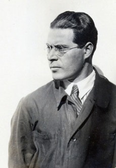
ImageLaszlo Moholy-Nagy

Laszlo was born July 20, 1895. He was born to a Jewish-Hungarian family. He attended Gymnasium, a high school in the city of Szeged. In 1914 he was sent into the Austo-Hungarian army. He experienced the horror of war on the Russian and Italian fronts, which remained with him for the rest of his life. He drew daily during this time as a soldier, sketching field life, his fellow officers, and the civilians he encountered. This was in a way his beginning as an artist, as when the war ended, he graduated with a law degree, but his heart lay with a brush, and later a camera. 

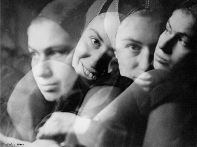
ImageLászló Moholy-Nagy, Untitled (Multiple Portrait), 1927, Collection Folkwang Museum, Essen

Moholy-Nagy was attracted to the art by Malevich and Lissitsky. He also studied the works of Rodchenko, Tatlin and Kandinsky in great detail and learned about the cultural aspects of the Russian Revolution. These men would influence his future work, and his own style would be influenced by Suprematism, Russian Constuctivism and Dada. Laszlo celebrated the countless resources of form and movement, the possibilities of where technology, as well as art were going.

ImageComposition Z VIII 1924

Perhaps his most crowning achievement was his construction of the Light Prop for an Electric Stage, a device with moving parts meant to have light projected through it in order to create mobile light reflections and shadows on nearby surfaces. This installation embodies the artists aim to introduce kinetic elements into a work of art. It is a greaty sum up for Moholy-Nagys interest in the unity of art and technology. 

Image

The Light Space Modulator, 1929-1930

After his work at the Bauhaus, which ended in 1928, he worked freelance and down the line a bit he was invited by Walter Paepcke, Chairman of the Container Corporation of America, he would move Chicago to become director of the New Bauhaus. This fell through a year later because of poor funding. Throught support from Paepcke, Laszlo opened the School of Design in 1939, later the Institute of Design in 1944. Moholy-Nagy died of leukemia in Chicago in November 1946. At the time of his death he was President of the Institute of Design, now having 680 students, a director of the American Designers Institute, of the CIAM (Congress Internationale Architecture). Many of his works are displayed in many locations, like the MOMA. Laszlo leaves his mark on art, and even technology, as he was one of the leading members to unify the two to create works that paved a path for many fields that he was involved in. 


http://monoskop.org/László_Moholy-Nagy

 http://www.theartstory.org/artist-moholy-nagy-laszlo.htm

 http://moholy-nagy.org/references/bibliography/

 Passuth, Krisztina. Moholy-Nagy. Trans. London: Thames and Hudson, 1985.


Art Nouveau – Eugene Grasset

Art Nouveau, an art movement that expanded from the late 1800’s to early 1900’s was a new style of visual arts and architecture that developed in Europe and North America. This movement was heavily influenced by Asian art, as trade was increasing between the two peoples. This art from Japan was overflowing into European and American art in ways the could still be seen in today’s art forms. At its height, Art Nouveau was a concerted attempt to create an international style based on decoration. Being developed by a brilliant and energetic generation of artists and designers, it was way to create an art form to conform to the modern age.  Art Nouveau was in many ways a response to the Industrial Revolution. Some artists welcomed technological progress and  embrace the advanced possibilities. Others hated the idea of mass produced machine made goods and aimed to elevate decorative arts to the level of fine art by applying the highest standards of craftsmanship and design everyday objects. Whatever side they were on, there were many leading individuals in this age that gave the movement its appeal.

           Image 

 Eugene Grasset 


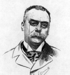
Among them,  Eugene Samuel Grasset who, being majorly successful in all areas of applied study, excelled at the illustrations of Art Nouveau. Grasset originally studied architecture, but was not very successful at achieving what he had hoped for. After going to Paris and picking up illustrations as on of his many  successful endeavors, he created the illustrations for stories like “Le Petit Nab” and “Histoire de quatre fils Aymon”. Like I stated above, Gasset was labeled by his fellow artists and anyone viewing his work as a universal artist. He understood various materials, how they each required a different approach, as well as their own fines. He was passionate about his work as well as the new technique  and materials that were being applied. His work was hugely expressionistic, changing shapes, shapes and lines that seem to jump off the page at you. 

                                     ImageImage

Grasset                                               Cheret


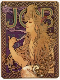
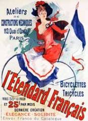
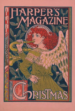
Being in the same time period as many other artists, all doing similar works, and most pertaining to graphic design, the were a few overlaps between works. In the example of Jules Cheret, and Eugene Grasset, both being features in your favorite textbook and mine, as both men’s works were similar in many ways. Cheret was regarded as the father of the modern poster. As you look at both Cheret and Grasst’s work, you will see the similarities that came with the times. The biggest similarity being the nature of advertising. Both were widely acclaimed graphic artists, using techniques and technologies that made graphic design into a mass media. These men would go on to create posters that would spread the word about merchandise like cigarettes, and build a bigger audience for theaters. I think that Art Nouveau was a milestone for graphic design development in its early years. The works of Japanese artists that spilled over into art in Europe and the United States was hugely loved and worked with by many artists. Art Nouveau paved the way for the graphic arts as we know it today.

 Image 


Work Cited


Artlex Art Dictionary, 1996

http://www.artlex.com/ArtLex/a/artnouveau.html


Gontar, Cybele. “Art Nouveau”. In Heilbrunn Timeline of Art History. New York: The Metropolitan Museum of Art, 2000–. http://www.metmuseum.org/toah/hd/artn/hd_artn.htm

Shepard Fairey

In art, creating something that is entirely your own can be a difficult thing. Think of what we are surrounded by, the almost unlimited source of material, of inspiration that even seeing a photo online, in a magazine or otherwise taken by someone else and using that for yourself. Not a bad thing I think, depending on how you go about it. My first thought is that Obama is a huge deal in the world, the first African American president in U.S. history, being iconic for millions of people. I believe Shepard made a powerful photo into a statement of, well hope. Art is

Expressive, its ever changing, its supposed to make you think, to make these statements that open up new doors. The thing that Shepard forgot to do, something that hasn’t changed in art, or in any form of mass media, using someone’s work, and making it your own without giving credit where credit is due.

What Shepard did is not respecting his fellow artist, the photographer Mannie Garcia, the one who took the Obama photo. Using his work without giving credit to Mannie isn’t paying homage to him. I feel connected to people in the art world. I feel we all want to put messages across in many different ways, and that we all should respect one another’s work as if it were our own. When Shepard, or anyone does something like this, its like taking a work they clearly think is well done and not showing your appreciation to the other artist. If I like someone’s work, if I think its work using, or modifying in any way, I would feel the need to go to them and appeal why I was doing it, depending on the subject matter. What if Mannie didn’t vote Obama, maybe he was just doing his job as a photographer and taking photos he sees as worth. Maybe he wouldn’t have wanted his work used in that sort of way. This is not the case mainly because he works as a photojournalist in Washington D.C. My point simply was that you never know what the other persons vision could be for his or her work.

The article talks of Shepard having a history of doing this sort of thing and getting away with it. Shepard has been arrested multiple times for his content matter being “knocked off” of others. People were up in arms about this because of his past in doing this before, this was just the straw that broke the camels back. Whether it was a more famous icon, known by all, or if it was just that sort of content that got peoples attention, either could work, it ruffled peoples feathers. It was for good reason, Shepard has been doing this sort of thing for years, and has been called out on it, has been arrested, knows it is wrong, and still does it. It would be as simple for him to just give a little shout out to the artist in question, yet he does not. Even if he means no harm with his actions, and even does them for good reasons, it is just not acceptable to use the work of others and not give them some sort of hand out.

I don’t think Shepard is a bad guy. I don’t think he is some malicious man out to pilfer and pillage the works of others and claim them as his own, don’t mind me in quoting the article, but the man is an activist, some of his works included making anti war posters, as well as anti Bush posters. He is not taking works and calling them his own, he is simply using what he thinks are good images, or interesting illustrations, and incorporating them into a design coming from his own head.  Shepard has made inspiring works, works that can be called iconic, works that feature larger then life people or messages, there is no doubt about it, but his methods, they are the things that are flawed, they are the things that get under our skin. This is coming from me, someone who is inspired by others works and styles, from someone who has used photos that are simply floating around the internet and incorporated them into their own work and had no idea where it was from, or who. I think somewhere along the line we have done it in one form or another, art or simply writing a paper. This does not mean we do it for bad reasons,  or that we should do it at all. This is saying that it happens. In relation to Shepard Fairey, it happened with one of those larger then life people,  someone that everyone is hearing about on a day to day basis, this is why we so heavily attack and make him answer for it.

Shepard wanted to create something that made an impact on people, that gave people something to see in a man that was bound to greatness. His simple red, white , and blue color scheme. His use of color and texture to create a simple, yet elegant rendering or Mannie Garcia’s photo. Was it impactful? Yes. Will we remember it in years to come, and go down in history of what people wanted to believe for Obama, of course! This is the picture I want to remember. Shepard took a already amazing and expressive photo and turned it into something greater. He familiarized it with us so that we see it for what it is, a sign of hope, a sign of how far we have come. It paints a picture of what it so come for our country, he creates hope. Shepard embodied this, with the help of Mannie. When we read this article, and listen to the talks we realize that Shepard just wanted to do his job in creating something to read with us. This just goes to show, as we go out into the world and do work to vocalize our causes, whatever they might be, we have to be considerate of others. To pay homage to them is to give thanks and show gratitude, for something that is not ours.